ShopDreamUp AI ArtDreamUp
Deviation Actions


Suggested Deviants


Suggested Collections


You Might Like…


Featured in Groups

Description
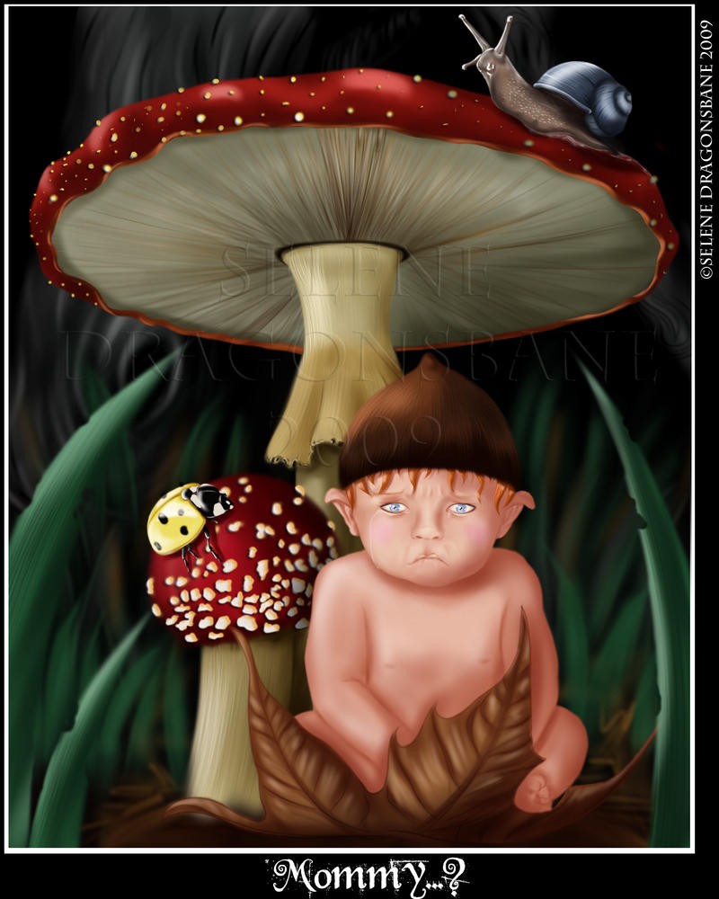
Acabado. No descarto hacerle algún retoque más adelante, pero estoy un poco saturada  , necesito cambiar de tercio y hacer otra cosa o terminaré por no acabarlo nunca
 ")
Debo confesar sin embargo que hacer este dibujo me ha enseñado muchas cosas. He recibido muchos consejos, y tambien muchos animos por parte de todos vosotros.
Es la primera vez que hago una ilustracion del tipo cuento infantil, me pareció un buen comienzo para diversificar un poco mis trabajos. Me gustaría que mi estilo se adaptase a todo tipo de trabajos, no solo a lo que estoy acostumbrada.
La idea era hacer un bebé gnomo perdido en un bosque, y como es la primera vez que pinto a un bebé espero que no seais demasiado duros conmigo jejeje. He salido de la espiral de mujeres desnudas, a pesar de que el niño tampoco tiene ropa
Mi proximo proyecto prometo enfocarlo a las telas y añadir algo de ropa a mis personajes
Espero que os guste
Programa: SAI
Maquetación: Photoshop
Tableta:Wacom
*English:
Finishing. Do not rule out some changes later, but I am a bit saturated need a change
I received much advice and too much encouragement from you all
It is the first time I make an illustration of a kind children's story, I found a good start to diversify a bit with my work. I would like my style is suited to all sorts of jobs, not just what I'm used to.
The idea was to make a baby gnome lost in a forest , and is the first time I paint a baby I hope it do not be too hard with me jejeje.
My next project promises to focus on fabrics and some clothes to add my characters
I hope you like
Program: SAI
Layout: Photoshop
Tablet: Wacom
Debo confesar sin embargo que hacer este dibujo me ha enseñado muchas cosas. He recibido muchos consejos, y tambien muchos animos por parte de todos vosotros.
Es la primera vez que hago una ilustracion del tipo cuento infantil, me pareció un buen comienzo para diversificar un poco mis trabajos. Me gustaría que mi estilo se adaptase a todo tipo de trabajos, no solo a lo que estoy acostumbrada.
La idea era hacer un bebé gnomo perdido en un bosque, y como es la primera vez que pinto a un bebé espero que no seais demasiado duros conmigo jejeje. He salido de la espiral de mujeres desnudas, a pesar de que el niño tampoco tiene ropa
Mi proximo proyecto prometo enfocarlo a las telas y añadir algo de ropa a mis personajes
Espero que os guste
Programa: SAI
Maquetación: Photoshop
Tableta:Wacom
*English:
Finishing. Do not rule out some changes later, but I am a bit saturated
I received much advice and too much encouragement from you all
It is the first time I make an illustration of a kind children's story, I found a good start to diversify a bit with my work. I would like my style is suited to all sorts of jobs, not just what I'm used to.
The idea was to make a baby gnome lost in a forest , and is the first time I paint a baby I hope it do not be too hard with me jejeje.
My next project promises to focus on fabrics and some clothes to add my characters
I hope you like
Program: SAI
Layout: Photoshop
Tablet: Wacom
Image size
1520x1900px 423.64 KB
Comments105
Join the community to add your comment. Already a deviant? Log In
Hi Selene! ¿Qué tal? <img src="e.deviantart.net/emoticons/s/s…" width="15" height="15" alt="
I came across this picture when I've been browsing through my subscribed deviations of the <img class="avatar" src="a.deviantart.net/avatars/d/i/d…" alt="
 " title="digitalartnetwork"/>-club where this wonderful work was listed too. And this picture with the fantasy-like scenery caught my attention right away. I don't know if it's my general fondness for fantasy themes that brought me to this picture, but probably it was just the cute little elf himself, with his clear blue eyes and his lop ears.
Your technique is alright - you painted clear and bold shapes that make it easy to capture the pictured objects. Sometimes the colors are a little too marked-off from each other and there are hardly any transitions of colors.
You have used layers, right? The problem is when layers look like layers. On the mushrooms' red hat, you have these white freckles. Maybe if you'd have painted them directly on the red shape after having finished its shadows, they would look like they were a part of the hat. But like this, they look like snowflakes who have just fallen onto the mushrooms. That's because they have no relation to the lower surface - the problem is again the border: they are too marked-off. On the border, some tones of bright red would be good, where the white goes to the red.
If you paint e.g. a blade of grass, you choose your tone of green, paint the shape, then add shadows and highlights, but you don't add varied shades of green. You should also try to give shadows and highlights a tone themself - shadows are usually not just black but rather blueish, lights are usually not only white but rather yellowish. Additionally, the foreground does have the same brightness at the top and at the end - it would be more exciting to have a contrast.
Here and there, you get at textures (the lower side of the mushroom, the snail), but in most cases the objects have a too smooth surface. If you want to add more realism, you should work on the textures more. Take a blade of grass and a loupe: where does it have veins, where is it thinner? It's hard ro rate a work because every viewer will get a different impression, but in my opinion 3 stars for your technique should be fair. I think that although you are still learning how to illustrate different surfaces and materials (soft skin, hard stone, brittle wood...), you already have a quite unique style that make forms look heavy - this is suitable for things like the chubby elf, but unsuitable for light leaves. Here and there you should try to "dissolve the surface"...you have managed that already at the thin part of skin around the upper mushroom's halm.
The usage of light and shadows is not that realistic, but effective for the vision: The background is dark enough to vanish into a black surface that doesn't draw off the attention from the objects in the foreground. The focus obviously lies on the elf who looks pretty uncomfortable under the mushroom. In order to emphasize his probably bad situation, I'd suggest to add raindrops and to make his skin tone look less healthy. At least his facial expression tells us that he must be sad. The tears and the title emphasize that. The elf's face, as an eye-catcher, builds up a close relation to the viewer. You want to know what has happened to him and you become fond of that little boy right away. On the other hand, the surroundings don't look really perilous. Okay, it's dark and the forest lies in nocturnal shadows, but the snail and the ladybeetle make it look like the elf's playground rather than danger.
The motive could be made more drastic to make the viewer feel even more for the boy, but like this, it's a neat and endearing picture. I would show this my 3-year-old brother without concern, if I had one. In his infantile pose and with his cute details, the elf can win the viewers over, and it comes clear that he feels unhappy, but you rather smile understandingly than really fearing for him. It is obvious that he's in no real danger and will be alright soon.
That much concerning the elf, as he is in a central position on the picture. What about the other elements? As I mentioned before, the two insects don't look very dangerous, as they are smaller than the elf. The ladybeetle and the snail look pretty realistic though, you certainly have used a template for them. But why not!
The mushrooms look like they protect the little elf. They are bigger than the mushrooms you usually find in the forest and they also divide the picture. I really like the composition because it is as neat as the motive. Although I'd prefer a more racy composition, the straight composition emphasizes the harmony that makes the elf's sorrow unfounded. The warm, bright colors that are used for the objects in the foreground are positioned in the middle and not even the large head of the upper mushroom is cut off at the border of the picture.
"Mommy..." is a neat picture that communicates well with the viewer. Thanks for sharing with dA, I hope you will keep up the good work and develop your style further.